Evaluation

Standard

Q1:  In what ways does your media product use, develop or challenge forms and conventions of real media products?
When researching I found there are various conventions for the indie genre which I used for all my products during A2. Through looking at music videos and doing qualitative and quantitative surveys I assimilated a stronger understanding of what makes up a conventional indie media product.  The most seen codes and conventions of the indie genre are black and white colours; extreme close ups and long shots, dark locations juxtaposed with bright colours, fast paces and use of cartoon looking effects. When creating the storyboard for our music video we took a lot of inspiration from other videos fitting to the same genre. The videos we looked at for camerawork and directing research were ‘Nero – Crush On You’, ‘Royal Republic – Tommy Gun’ and ‘Silversun Pickups – Panic Switch’.

The video ‘Nero – Crush On You’ uses the scenery to  juxtapose the developing narrative. The medium close up shots of the couples really establishes the fact they are all different girls and shows the audience the facial expressions of the girls ‘in love’ and the guy ‘in lust’. For our video we wanted to utilize this for when we did the different shots of the two couples staring in our video. This also worked with our video as it would allowed us to establish that the male characters were played by females, and the female characters were played by males which would exagerated the humourous element we contrasted with the narrative in order to gain the quirky ‘Indie’ genre representation within our music video.

The video ‘Royal Republic – Tommy Gun’ uses the camera as a directional prop as the lead singer of the band is literally singing to the camera – which draws in the audience more as they feel more of a connection to the music video because they feel involved. I also like the fact that the video is so simple yet so effective which we wanted to create with our footage as it relates heavily to the minimalistic yet effective approach many ‘Indie’ videos take. When researching this video I found out it wasn’t even meant to be filmed. The band, Royal Republic, were doing a photoshoot with Bingo Rimér who decided it might be fun to mess around. I used this as inspiration for directing and tried to create some suprises when filming so the actors emotions were made more believable by the audience. During the video the lead singer, who is sat directly in front of the camera had absolutely no idea what was going to happen next as all he was told to was was sit down infront of the camera and lip sync. This adds a humourous element to the music video and builds a stronger connection between the video and the audience as when the audience is watching the music video they feel as though they are experiencing what the lead singer is. We really wanted to create this sort of connection between the audience and the music video and by using the element of suprise and close-ups inspired by this video I believe we did that.

The video ‘Silversun Pickups – Panic Switch’ has a unique element to the music video and this is done through editing which even though is a simple technique uses the indie genre stereotypes. The camera shots differ from medium close ups to extreme close ups and the most important element is colour. We used this  in our video and used mostly medium and extreme close ups and by not using many establishing shots as I wanted the character to seem quite isolated from is surroundings which made it even more surreal and effective when he saw his ex’s who are now played by male actors.

Here is the rough cut of the music video:

With the majority of indie music videos the genre specific identity is linked to the quirky editing during post-production so the most important thing for our group to focus on was how to maintain a video with a high level quality of edited footage. For editing we had to use FinalCut Pro and before doing so looked at some videos which used strong techniques that the indie genre adopted over the past years. Whilst re-editing I didn’t feel we had fully tapped into the comic availability in our footage. This is where the idea of typography popped up, we had always said we were going to place ‘a student production’ in the opening shot of us in the class room however I had the idea to make the couples characters and my idea came from watching and reading the story revolving scott pilgrim having to kill the woman he is in love withs 7 exs. Mat thought it would be a good idea to have a freeze frame of the characters as we did the typography. The typography and style of editing we were inspired by are evident in this clip from the film ‘Scott Pilgrim Vs. The World’:

Below is the final version of our music video, ‘Citizens – True Romance’:


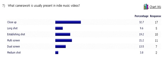
Before completing the music video, digipack or website I created an online survey at host website where the results allowed me to make an informed decision about what an audience expects from an indie media product.  The results were conclusive with the majority of my research so I made my creative decision within the guidelines of the conventions. Here are the results I believe were most influential in making the creative decisions relating to indie genre conventions that I based my media products on:

When creating the three products I made sure there was a strong bridge between the three so all decisions affected all three of the media products. Indie genre products always have a unique selling point (UNP) so to make our music video different we focused on costume that had a humorous element. We decided all roles would be reveresed for the video, men would be dressing up as the female characters and women would be dressing up as the male characters. The men were put in costumes that related to different subcultures (hip hop and preppy) with heavy makeup and were made out to clearly be men in drag. The women wore also wore stereotypical clothing relating to the nerd and jock subculture and both had drawn on facial hair that was very over the top to reinstate the comedy feature that is evident in a large majority of indie media products.  Mat, who played the protagonist in the video was dressed very plainly and similar to that of many indie artists when they appear in music videos – by this I mean he was very dressed down and casual. We chose to create a multi-strand linear narrative which after research found was very typical of the indie genre. In many indie music videos there is a story attached to the song that often relates to it but it is also acceptable for it to not necessarily connect with the lyrics and connotations of the song unlike many other genres.

In the indie genre the conventional use of colour is very contradictory, it is either very bright and over the top or extremely plain and purposely under rated. When we first heard the song ‘True Romance’ by CITIZENS! which was very upbeat and cheerful (contradicting to its sad lyrics) we decided to reflect this element in the narrative so we edited the footage to give it a darker colour which contradicted with the bright orange font we used to state the characters names when they appeared on the screen. In doing so we immediately established our video as compliant with the indie genre.
When I was creating the website I originally wanted to make it very plain and under rated but after watching the video we created to gain inspiration for the design I noticed the bright colour of the font. I then decided to use that element from our video on the website and made both the splash page and home page very bright and colourful which is highly representative of the indie genre. I decided to create an enter page as I thought if I were to realisitcally create a website for a band then this would be ultimately free advertising for the digipack I created. I only wanted a picture of the digipack and links to buy it on iTunes and Amazon as I really wanted these things to stand out on the page. I really wanted to make sure the page didn’t look cluttered as I think if it did the advertising won’t be as effective as it could be. For my splash page I drew most inspiration from Lil’ Wayne’s:

Even though this enter page isn’t connected to my genre and is in fact connected to one that contrasts mine completely I believe the effect this creates is ideal advertising for any genre. I also liked the idea of the links to facebook, myspace and twitter at the bottom of the page however instead I chose to place the links along the side as it created a better look with the colour scheme I chose.  The ideal image for this style was something with a central image, muted colours and contrasting colours so it is noticable but doesn’t take away too much attention from the links on the page itself. Unlike many enter pages I  avoided having a scroller on the right hand side. I chose to make the page fit to the size of the screen as I thought it looked a lot tidier and professional.

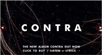
For the home page I wanted a very clean and tidy design which really spoke for itself meaning I had to make the colour scheme noticeable and the clutter minimal. On ‘The Vampire Weekend’ home page they used a design which inspired me to create my own

The two arrows I have circled are the design element I am looking at here. Although I wanted to predominantly advertise the digipack I created I also thought it would be a good idea to have music videos on there. By using design elements like this I believe I am conforming to the classic representation of Indie genre websites as well as developing them to the new standard seen within the genre.

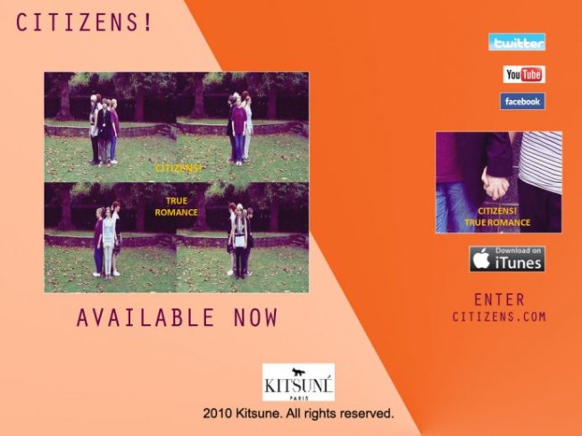
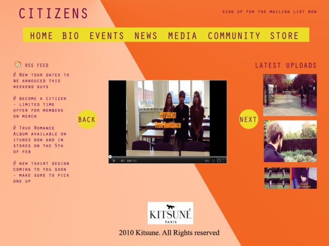
Below are the final pages:

Splash Page

Home page

After researching and planning my website which at first was only the home page I then decided to create a splash page as that was also reflective of the indie genre. Unlike many artist websites I tried to make the splash page as plain as possible as I didn’t want it to distract from the design of the page and therefore the colourfulness and brightness which in the indie genre often overpowers the content on the website pages. The clashing dark orange, light orange and bright yellow allow the page to be very over the top and very ‘80s’ looking which is seen on many indie artists websites and is what made me sure to use it.
My digipack explores another element of the indie genre. I wanted to take snapshots from the music video as I believed this would fully like the three media products but after looking through it and noticing three different locations – the college, the high street and the park – I decided I wanted to use the footage from the park. Below is  the presentation I created to show my digipack inspiration before I began designing:

Here is my final digipack:

Often in the indie genre they use wildlife and the outdoors to contrast with bright colours or random themes so I used the digipack to comply with this convention of the genre. All the footage I used contained very naturalistic colours like greens and blues so for the font I decided to use bright orange and bright yellow to contrast the images and in doing so further represent the genre as I said before the majority of indie genre media products are purposely contradictory.
Throughout my production of these three media products I believe I partially challenged some indie genre conventions however in doing so used many of the other conventions. The indie music genre is made up of highly contradictory codes and conventions so I played on this as much as I could.

Q2:  How effective is the combination of your main product (music video) and ancillary texts (the website & digipak)?
When creating my three media products I tried to create a bridge that ran through all three so they had a clear collective identity which if was truly used by a band would give them a UNP. I decided to incorporate bright contrasting colour similar to that of the font we used in the music video to show the ‘names’ of characters. This conforms to the indie genre and allows my three media products to connect as they all have the same colour in them.
Whilst making the music video I also had the digipack and website in mind as I knew that I would be using images from the video to use for the other two media products. So when we were producing the video we made sure the costume and settings could comply with a variety of themes for the other media products. For example the three locations we use each had different elements to them.
Together I think the main product is strengthened by the ancillary texts. I made the products with different identities as they each have different elements in them when compared however if you look at them all together they work well. The music video links to the website through the pictures from the video on the home page, the music video on the home page, the colour used for the background which is present in the video and like in the video the colour contrasts the video. The music video also clearly links to the digipack as it has snapshots from the video as the images and also has the orange font on the cover. However if you look at the digipack and website they don’t have as much that connect the two as one is very naturalistic which isn’t present on the website and the only thing connecting the two is the music video and the orange and yellow bright colours that are apparent in the two. I have used the bright orange and yellow to connect the three media products and give them a both a UNP and stand out look which would set them apart from other indie genre media products that played upon the understated looking codes and conventions.

Q3:  What have you learned from your audience feedback?
There has been a mixed response on my media products however most of the negative comments are due to the person not liking the indie genre conventions and aren’t because they don’t think they don’t comply with them.
The music video had the most positive feedback as people said they thought it was unique and different to things they had already seen repeated a few times too many. Like many indie genre media products I tried to make mine stand out and be different which is the ideals of many indie products. Many people said they liked the hand held camera element to the music video and most of all appreciated the humour seen with the role reversal which also connects the three products.

The feedback we got back on our products was:
Positives:

  • handheld
  • stop motion figures
  • good ideas behind them
  • for the time we had was a good achievement
  • liked the use of bright colour and liked that it contrasted with location

Negatives:

  • a large majority of it was the protagonist walking
  • although the idea was good the execution was lacking
  • less cutaways than other people
  • one girl didn’t understand the narrative and said it was unstructured
  • the colours clashed

I think in conclusion the audience feedback we got was varied however was constructive and allows me to see where I could have strengthened the products I created.
Q4:  How did you use media technologies in the construction and research, planning and evaluation stages?
During the process of creating my three media products I had to use many different technologies to ensure I made the best one I possibly could do.
When I was going through the planning and research process I mainly used websites. When I was researching aspects of filming like lighting and camerawork I used mainly Google as I found the search engine came up with brilliant articles with key information. However when I was researching the codes and conventions of music videos I found YouTube was the best place to look. Instead of looking up articles I decided to watch different genre videos in order to gain more understanding on them.
When constructing the media products I had to use a variety of software like Final cut Pro for editing the music video, Dreamweaver for the website, InDesign for the digipack and Photoshop CS3 for both the construction of the digipack and the website. By using all these different programs I found myself hastily developing my understanding and it helped me develop my products to a more sophisticated level at the end.

As I am not very confident using Adobe Dreamweaver CS3 but I wanted to create a unique and realistic artist website I decided to start researching it already and looking at various tutorials for what I wanted to do on my website. In order to create a realistic website design without much experience I utilized YouTube’s brilliant software based tutorials before starting and during the process too. The main tutorial I focused on to create a professional look is below:

Whilst creating our video we also used many YouTube tutorials as only one of us had used Adobe Final Cut Pro once. We wanted many various editing techniques such as split screens, sped up footage, slow motion footage and colour distortion so we used most of the official tutorials and some of the home made ones too. Below are the tutorials we used to create out music video:

By using other technology like video tutorials and how-to articles online we not only furthered our understanding of the software but also improved the standard and quality of our media product.
Whilst evaluating I had conducted both qualitative and quantitative surveys which I have conducted on online survey host websites and websites where I can share there surveys like Facebook and Twitter. However the one source I used most was my blog on WordPress where I have been able to document my research, planning, construction, evaluation and development throughout creating these three media products.

 

Final Website Design

Standard

I decided to incorporate bright contrasting colour similar to that of the font we used in the music video to show the ‘names’ of characters. This conforms to the indie genre and allows my three media products to connect as they all have the same colour in them.

I decided to also create a splash page as after looking at other indie bands websites it conformed to the genre. On the splash page it advertises the album and has two different album covers as that is often seen on websites and there are also links to itunes, facebook, youtube and twitter.

My splash page:

Here is my home page:


Below is the html link for my final website

https://go.orpington.ac.uk/easylink/wf.london.s/intake11/media/40032684/Citizens!%20Home%20Page.html


Final Digipack

Standard

After going back and forth on templates I finally decided to use a basic one as this was actually more likely to be seen with indie bands and therefore conformed more to the genre than templates like ‘Maltese Cross’ or an ‘8 Panel’ digipack which were better suited to the pop or hiphop genre.

When completing the digipack I chose to use snapshots from the music video as it is typical of indie genres as it advertises their video at the same time as selling the album. There are three different settings in the video – the college, the highstreet and the gardens – so I decided to chose the gardens and focus on that as in many indie music videos and album covers there is a clear theme of wildlife and the outdoors.

Here is my final digipack:

Citizens - True Romance

Evidence of my individual role

Standard

During the filming:

  1. I brought all the costumes (not including the wig) which consisted of a grey shirt, chinos, a satin skirt, black tank top, fur gilet, baggy purple top, black and white striped strapless top and a handbag.
  2. I created the storyboard after discussing the idea with the rest of the group.
  3. I picked up all the equipment and brought it to college that day as well as signing for the camera as I am over 18.
  4. I managed communication between everyone, including the actors getting on set on time and telling the group where to meet.
  5. I set up the camera with sammie and mat.
  6. I filmed all the scenes at college, walking down by the green, walking down the highstreet and crossing both zebracrossings and chess did some filming of mat at the end of the high street.
  7. I arranged the people in their positions for stop motion figures including the ones I was in. And I helped film the stop motion figures I wasn’t seen in as well as filming mats stop motion figure portrayal on the high street.
  8. I told and showed the first couple and the couple I was in the positioning they needed to maintain during the shoot as well as creating the actions they had to do in order to get the right looking action scenes for the filming.
  9. I returned the camera and equipment to alan at the end of the day and have been in charge of keeping the tape since.

Post Production:

  1. I was in control of the mac for editing all of the rough edit and helped send the footage along with sammie and chess.
  2. I created all the multi and dual screens during editing.
  3. I have been in control of doing a great deal of the editing as nearly every lesson I have been at the computer.
  4. I have made executive decisions with sammie when the other half of the team weren’t able to make editing sessions and we have discussed it with them later at the next session they attended.

Production update & personal target

Standard

Due to the fact we were ahead with the rough edit we have decided to majorly focus on the re-editing of footage we have already got. As we have had more time to contemplate our idea than other groups we have been lucky enough to have evolved it sufficiently to our preferences, this includes putting new footage into the video which we previously overlooked in our hurry to meet our deadline.

Thursday 8th of December – we will have put everything in the correct sequence by the end of the lesson and have a clear view on which effects we are going to use.

Friday 9th of December – we will use the effects we decided on previously and place them in the video.

Monday 12th of December – we will review the final video and discuss any appropriate changes we may wish to make as well as inserting the typography we have decided on.


My personal target is that we manage to evolve a very professional, create and original video that we can all be proud of making. I also of course hope we create a suitable video for our target audience.

Feedback On The Rough Edit

Standard

In class the other day whilst up in the editing studio on the tenth floor we showed our rough edit of Citizens-True Romance to the class. This was a very important exercise as it allowed us to gain feedback from the people we would hypothetically be targeting. However when looking at the points made it is important to keep in mind that not all of the students watching the video conform to our target audience but the points they made are still very valid as they are familiar with camerawork, lighting, costume and editing.

Positives:

  • handheld
  • stop motion figures
  • good ideas behind the video
  • for the time we had was a good achievement

Negatives:

  • a large majority of it was the protagonist walking
  • although the idea was good the execution was lacking
  • less cutaways than other people
  • one girl didn’t understand the narrative and said it was unstructured

How are we going to change this?

Before the showing of our rough edit we were well aware that there wasn’t enough ‘action’ so to speak of in the music video and were even advised to put in more footage of the couples. When watching it back ourselves we agreed there was too much walking and that we were missing out on some of the great shots we have acquired through filming.

I believe the execution of our idea was mainly lacking due to the fact there wasn’t enough footage of the couples in the video which we are sorting out much more. There are much more cutaways than in other peoples videos however due to making it originally for a possible client we made sure we didn’t use people pretending to be the band as we thought in the pitch this could disadvantage us in the long run. This is also one of the aspects I am most fond with as I believe it reflects the Indie genre rather well overall. In many Indie music videos there is only a strong narrative and often the band members are involved in it.

Website Design Inspiration and Initial Ideas

Standard

As I am not very confident using Adobe Dreamweaver CS3 but I want to create a unique and realistic artist website I have decided to start researching it already and looking at various tutorials for what I want to do on my website. 

As we have already filmed the music video I wanted to start focussing on both the digipack and website as I know if I leave it until January I won’t have enough time to do any indepth research or planning for either of these things.

Pictures For the Website:

The most practical solution for this is when I take photographs for the digipack I will also take photographs that can be used for the website. I will only be able to start contructing the website when I have completed the digipack as I have decided that I want an ‘Enter’ page advertising the digipack I have made with phantom links to iTunes and Amazon where you can hypotethically buy the album.

Enter Page

I have decided to create an enter page as I believe if I were to realisitcally create a website for a band then this would be ultimately free advertising for the digipack I am going to create.

I am going to create the enter page in HTML and try and keep it as simple as possible. Ideally I only want a picture of the digipack and links to buy it on iTunes and Amazon as I really want these things to stand out on the page. I really want to make sure the page doesn’t look cluttered as I think if it does the advertising won’t be as effective as it could be.

I will also use CSS formating inside of the HTML page to make sure the design looks neat and organised so I can make it look as uncluttered as possible. This is an example of the sort of design layout I want for my enter page:

Even though this enter page isn’t connected to my genre and is in fact connected to one that contrasts mine completely I believe the effect this creates is ideal advertising for any genre. The only things I would change is the album thumnail as a Hyperlink and would just have the iTunes and Amazon icons. I also like the idea of the links to facebook, myspace and twitter at the bottom of the page. I would ideally like the image to cover the whole of the page however this all depends on the image I am going to use for my digipack as if I use one with too much in the background or with digital inserts it wouldn’t work as well. The ideal image for this is probably something with a central image, muted colours and contrasting colours so it is noticable but doesn’t take away too much attention from the links on the page itself. Unlike many enter pages I would also like to avoid having a scroller on the right hand side. I really want it to just fit the size of the screen as I think it looks a lot tidier and professional and this is something I would like to do with a lot of the pages like the home page.

I was also considering having something along these lines on the front page:

The two arrows I have circled are the design element I am looking at here. Although I want to predominantly advertise the digipack I create I also thought it would be a good idea to have music videos on here.

However as I want to keep the design simple and organised which is why i’m going to use a CSS format on the HTML page I am unsure about whether to use this for the enter page or whether I should use it for the home page which would probably make more sense as it would be showing ideal contents available on the page. I could even have each members bio when you click the arrow and have a page dedicated to each of them.

Feed Computer icon.

RSS Feed (Really Simple Syndication)

On the news section of my artist website I want to create an RSS feed which is often used for publishing frequently updated things. The RSS feed is web based, desktop based and mobile device based, so when looking at hypothetically creating an artists website this sort of programming would be ideal.

The RSS reader checks regularly for new work, downloads any updates that it finds, and provides a user interface to monitor and read the feeds. RSS allows users to avoid manually inspecting all of the websites they are interested in, and instead subscribe to websites such that all new content is pushed onto their browsers when it becomes available. By giving my artist website such great technology and devices it allows fans of that band to access their information in various ways and gives an alternative to other slightly outdated pages.

 It allows you to easily stay informed by retrieving the latest content from the sites you are interested in. There are many benefits to RSS feed and web feed as it allows you to subscribe without giving out your email details which is appealing for the user as it means they are much less likely to recieve spam or viruses.

When looking through tutorials for Adobe Dreamweaver CS3 on youtube.com I came across a tutorial for a floating sidebar menu which would be ideal for the RSS feed and other links such as the band/artists YouTube acount, Facebook, MySpace and Twitter.

PART ONE:

PART TWO:

HOME PAGE FEATURES

For the home page I have decided I would like a CSS horizontal drop down menu as I have seen these present on many other artists websites like Kings Of Leon, Vampire Weekend and Katy Perry. I would like to avoid menus like on Silversun Pickups artists website as I think it looks outdated and doesn’t conform to what the contemporary website viewer wants. Through using structured HTML and simple CSS, it makes it possible to create a visually appealing drop-down menu that is easy to edit and update, and that works across a number of browsers, including Internet Explorer. Better still there is no JavaScript required for it.

There are a lot of helpful and useful codes here 🙂

  • Works in modern browsers withoutscript support.
  • Compatible with Internet Explorer 5 (Win and Mac OS9).
  • Based on nestedLists.
  • Current page link appears selected.
  • Sub-menus for the current page are visible by default.
  • Stylesheets are CSS hack-free.
  • In case there is no script support, Top Level List Items are linkedto top level documents (mostly for Internet Explorer).
  • In modern Browsers and Internet Explorer, this menu is Keyboard friendly (offset links are accessible).
  • It uses only one hookper Top Level list items.
  • It is Standards compliant.
  • It addresses Accessibility Guidelines.
  • It is Search Engine Friendly.

Website Design Research

Standard

WEB 2.0

For creating my artist website I have done some research on Web 2.0. When I did my online questionaire over half of the 20 people I asked said they expected an indie genre artists website to be in a blogging format so I started thinking about Web 2.0.

A third important part of Web 2.0 is the social Web, which is a fundamental shift in the way people communicate. The social web consists of a number of online tools and platforms where people share their perspectives, opinions, thoughts and experiences. Web 2.0 applications tend to interact much more with the end user. As such, the end user is not only a user of the application but also a participant by:

  • Podcasting
  • Blogging
  • Tagging
  • Contributing to RSS
  • Social bookmarking
  • Social networking

For marketers, Web 2.0 offers an opportunity to engage consumers. A growing number of marketers are using Web 2.0 tools to collaborate with consumers on product development, service enhancement and promotion. Companies can use Web 2.0 tools to improve collaboration with both its business partners and consumers. Among other things, company employees have created wikis—Web sites that allow users to add, delete, and edit content — to list answers to frequently asked questions about each product, and consumers have added significant contributions. So this type of website really would be ideal for a band as it would encourage an online community and forums on the artists website creating more hits.

WEB APPLICATION FRAMEWORK – ARCHITECTURE

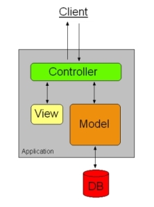
Most web application frameworks are based on the model–view–controller (MVC) architectural pattern. The model-view-controller is a software architecture,currently considered an architectural pattern used in software engineering. The pattern isolates “domain logic” (the application logic for the user) from the user interface (input and presentation), permitting independent development, testing and maintenance of each (separation of concerns).

THE MODEL – VIEW – CONTROLLER (MVC) ARCHITECTURE

Many frameworks follow the model–view–controller (MVC) architectural pattern to separate the data model with business rules from the user interface. This is generally considered a good practice as it modularizes code, promotes code reuse, and allows multiple interfaces to be applied. In Web applications, this permits different views to be presented, such as web pages for humans, and web service interfaces for remote applications.

WEB TYPOGRAPHY

Web typography refers to the use of fonts on the World Wide Web. When HTML was first created, font faces and styles were controlled exclusively by the settings of each Web browser. There was no mechanism for individual Web pages to control font display until Netscape introduced the <font> tag in 1995, which was then standardized in the HTML 2 specification. However, the font specified by the tag had to be installed on the user’s computer or a fallback font, such as a browser’s default sans-serif or monospace font, would be used. The first Cascading Style Sheets specification was published in 1996 and provided the same capabilities.

A common hurdle in Web design is the design of mockups that include fonts that are not Web-safe. There are a number of solutions for situations like this. One common solution is to replace the text with a similar Web-safe font or use a series of similar-looking fallback fonts.

Another technique is image replacement. This practice involves overlaying text with an image containing the same text written in the desired font. This is good for search engine optimization and aesthetic purposes, but prevents text selection and increases bandwidth use. Also common is the use of Flash-based solutions such as sIFR. This is similar to image replacement techniques, though the text is selectable and rendered as a vector. However, this method requires the presence of a proprietary plugin on a client’s system. Another solution is using Javascript to replace the text with VML (for Internet Explorer) or SVG (for all other browsers). However font hosting services allow users to pay a subscription to host non-Web-safe fonts online. Most services host the font for the user and provide the necessary @font-face CSS declaration.

Here is a list of web safe fonts I have the option of chosing: WINDOW FONTS/ MAC FONTS/ FONT FAMILY

Arial, Arial, Helvetica, sans serif

Comic Sans MS, Comic Sans MS 5, cursive

Courier New, Courier New, monospace

Georgia 1, Georgia, serif

Impact, Impact 5, Charcoal 6, sans-serif

Lucida Console, Monaco 5, monospace

Lucida Sans Unicode, Lucide Grande, sans-serif

Palatino Linotype, Book Antiqua 3, Palatino, serif

Tahoma, Geneva, sans-serif

Time New Roman, Times New Roman, Times, serif

Trebuchet MS 1, Trebuchet MS, sans-serif

Verdana, Verdana, Geneva, sans-serif

Symbol, Symbol (Symbol 2, Symbol 2)

Webdings, Webdings (Webdings 2, Webdings 2)

Wingdings, Zapf Dingbats (Wingdings 2, Zapf Dingbats 2)

MS Sans Serif 4, Geneva, sans-serif

MS Serif 4, New York 6, serif


I have decided I will use: Palatino Lunotype, Book Antiqua 3, Palatino, serif


WEBSITE WIREFRAME

A website wireframe, also known as a page schematic or screen blueprint, is a visual guide that represents the skeletal framework of a website. The wireframe depicts the page layout or arrangement of the website’s content, including interface elements and navigational systems, and how they work together. The wireframe usually lacks typographic style, color, or graphics, since the main focus lies in functionality, behavior, and priority of content. In other words, it focuses on “what a screen does, not what it looks like.”

Wireframes focus on

  • The kinds of information displayed
  • The range of functions available
  • The relative priorities of the information and functions
  • The rules for displaying certain kinds of information
  • The effect of different scenarios on the display
The website wireframe connects the underlying conceptual structure, or information architecture, to the surface, or visual design of the website. Wireframes help establish functionality, and the relationships between different screen templates of a website. An iterative process, creating wireframes is an effective way to make rapid prototypes of pages, while measuring the practicality of a design concept. Wireframing typically begins between “high-level structural work—like flowcharts or site maps—and screen designs.” Within the process of building a website, wireframing is where thinking becomes tangible.

Re- editing the rough edit

Standard

When looking back over the rough edit we have decided to do things much differently.

So what have we changed?

  • In the re-edited version we plan on editing the contrast and brightness levels so Mat is in a darker light which represents the cloud following him around and the couples are shown in less contrast and a brighter light to show their honeymoon period.
  • When Mat leaves the classroom door I managed to create a dual screen in sepia and kept this for when he was going down the stairs too. Brightness = -21; Contrast = -3; Sepia Amount 100; Highlight 26.
  • We did the dual screen by layering the images, putting the first in V1 and the second in v2. You then click on the second sequence in V2 and a crosswire appears which you then crop to the size you want and do the same with V1.
  • We then decided to do quite a dramatic change in regards to editing. When I was looking through the effects I could use we came across HSV Adjust, Light Rays and Sharpen which when I fidled around with them ended up looking slightly sketched and instantly reminded me of A-ha – Take On Me. I then looked at the video and fell in love with the contrast of the normal image and the sketched image. After considering what direction it would take our video in I thought it would actually go alongside the narrative very well as it is all about Mat being in his own world and the couples being in another.
  • In order to adhere to continuity editing rules I wrote down all the numbers for each editing effect so I could re-do it exactly in each frame and it would also allow me to finish the editing quicker so have more time to review it and look at what needs working on. For the HSV Adjust the Salvation was 2.74 and the Value was 1.64. For the Light Rays the Amount was 42, the Glow was 1.66 and Expansion was 0.7. The Sharpen effect wasn’t changed and we left it as it was originally.

Whilst doing the editing I didn’t feel we had fully tapped into the comic availability in our footage. This is where the idea of typography popped up, we had always said we were going to place ‘a student production’ in the opening shot of us in the class room however I had the idea to make the couples characters and my idea came from watching and reading the story revolving scott pilgrim having to kill the woman he is in love withs 7 exs. Mat thought it would be a good idea to have a freeze frame of the characters as we did the typography and everybody agreed so at the end of editing the video we are going to research how to insert the typography.

Here is the kind of typography styles we would like to do:

So in order to have a professional effect like this I’ve decided to freeze frame the image we want and drag out the time on it where we have the text and some other quirky effects characterising the egos of the couples! I found some really good tutorials on how to do this as I’ve decided to research it for tomorrow so when I do it I won’t have to waste any time researching this.

Here is how we are going to freeze frame, it is right at the start of the tutorial and the rest is obselete to the look we want to create:

Today we finally came to a decision on which effect we wanted to use throughout the music video as we were very sceptical using more than a few would still maintain the professional appearance we were so keen on creating. The effect is very basic but synchronises well with our shots and camera angles. It’s quite ironic that after looking at some of the advanced effects like ‘line art’ and ‘posterize’ we decided to use a simple colour balance change which meant us moving the green shadow to -1 in each shot. We also created the freeze frames that will allow us to build the ‘characters’ in each couple where the typography will include a name, generic bad relationship trate and how many relationships they have been in. We thought this would give our video a more sophisticated and contempory look as it is used in many films at the moment and related to the transition of graphic novel to film genre. In our freeze frames we leave a one second blackout then the image (as if it were snapped) and change the contrast to 67 then we leave another one second blackout before the character continues their movement. We created the freeze frames by getting the image up on the sequence box in final cut pro then going to modify and clicking ‘freeze frame’ which then popped up with another box containing the freeze frame then you have to drag the image and as you place it over the video it will come up with a box that says ‘superimpose’ which you drag it into. After which you can play around with the footage and to ensure ours looked in sequence we placed the razor tool on where we had stopped the video to get the freeze frame and cut it in half so we could place the freeze frame in the middle which gave the effect of it being a snapshot! Overall I’m very pleased with this effect and so glad we decided on doing it. I have thoroughly enjoyed my first experience of final cut pro and am now a very keen editor and hope I get a chance again soon to edit more footage.

When researching how to insert text into a video on Final Cut Pro 4 I found this and thought it explain and showed us how to do exactly the kind of thing we were looking to create for the characters screenshots.


For some of the shots we wanted to include animated text for example when mat makes a angry face we wanted to include moving black text saying ‘grr’ similar to the animated text in Scott Pilgrim Vs The World. I found another tutorial on YouTube explaining how to do this exactly the same way we wish to. Here is the tutorial:


Contingency Plan & Music Video Production

Standard

Even though we have already had to film all of the music video & edit it due to a tight deadline this isn’t as relative as it would have been. However we have decided to reshoot some of the scenes which were a bit shakey or had bad lighting.

Shooting: Indoor scene

Time & Date: 11th of November 2011

Time Period: 20 mins max

Who we need: Mat

What if: Mat can’t come or there is no one to film? Then we’ll have to rearrange the filming.


Shooting: High street stop motion figures

Time & Date: 18th of November 2011

Who we need: Mat

Time Period: 30 mins max

What if: Mat can’t come? We will have to arrange another reshoot

It is raining? We will have to cover the camera or reshoot another day


Shooting: Stop motion figures in the Priory Gardens

Time & Date: 21st of November 2011

Who we need: Ollie, Me, Ryan, Mat, Naomi

Time Period: 45 mins max

What if: Somebody cant make it? We will have to reshedule the filming.


Editing Days

Monday 14th of November 2011

Monday 28th of November 2011

PRODUCTION SHEDULE

FILMING – 21st of November

EDITING – 5th of December

DEADLINE FOR EDITED MUSIC VIDEOS – 5th Dec

EDIT SUITE/STUDIO/ LIGHTING – we have to book in advance if we want to use these. The times are listed on Alan’s door (1007)

CAMERAS – it is a good idea to book the edit suite at the same time as cameras so we can begin digitizing material/logging footage and complete edit shot list on return.

FILMING – We should create a ‘video diary of the process’ for insert into our evaluation.


Filming Permission from the Council

As the majority of our filming happens outside of the college on the councils property for the reshoots of certain shots we have had to apply for permission again. We have been sent a for to fill out which I have copied below and have had our lecturer send the coucil our ‘Public Liability Insurance’.

Small Crew Notification for Filming in London

Small Crew is defined as a crew of five people or less, using handheld cameras or cameras on tripods only

Contact Name: Charlotte/Sammie/Chess/ Mat Application Date: 15 November 2011
Company: Bromley College incorporated with Orpington College: Orpington Campus Number of Crew: 4
Name of Production: Citizens! True Romance (unofficial) Tel No: 07805417696(Charlotte)               07948063014 (Sammie)
07969465075 (Chess)
Address:  The Walnuts, Orpington BR6 0TE Fax:  N/A
Email: alevelmediastudies@hotmail.co.uk  


Please state the locations you would like to use along with a detailed explanation of each scene to be filmed (please ensure you list all streets)      
Location (including all streets) Date Time Description of shoot
Orpington High Street (High Street, Town Centre Orpington)


The Priory Gardens (Orpington)


Orpington college campus (The Walnuts, Orpington BR6 0TE)


18th November


23rd November


18th November

12 noon – 3 pm


12 noon – 3 pm


11:30 – 12 noon

We will be filming one guy walking down the high street.


We will be filming on the green the couples that are in our music video.


We will be filming one guy walking out of the college and listening to his music- Citizens! True Romance (with headphones)


Type of Production:

Student Production: Music Video for A2 Media.


This notification is not suitable for productions using any additional equipment, special effects, street dressing, stunts etc. Please call 020 8313 4351 for a ‘Filming and Photography Licence’.

Productions containing any of the following, should also contact local police or the Met Police Service Film Unit (MPSFU) on 020 7161 1099

  • · Violence     
  • · Firearms or other weapons
  • · Scene of a crime, or offensive nature
  • · Actors in police or other emergency service uniform
  • · Marked police car or other emergency service vehicle


Contact details for BFS and local police can be found on the Film London website: www.filmlondon.org.uk/guide


Please also send evidence of your current Public Liability Insurance Certificate